Coursework: Film poster research and pre-production
What do you need to produce?
You should create three posters to help promote the same feature film. You should identify the typical placement locations for each poster.
Each poster should be different and target a specific segment of the target audience. Specifically:
You should create three posters to help promote the same feature film. You should identify the typical placement locations for each poster.
Each poster should be different and target a specific segment of the target audience. Specifically:
- Fans of the genre
- Females
- Males
The posters will be used to promote screenings of the film at a local film festival and the layout and design of each poster should be appropriate for its intended location.
Each poster should use a different image but the advertising campaign should appear coherent. Audiences should recognise each poster as being part of the same campaign.
Minimum requirements
Each poster should use a different image but the advertising campaign should appear coherent. Audiences should recognise each poster as being part of the same campaign.
Minimum requirements
- Appropriate layout and design choices for each poster
- Three different posters, each identifying a specific segment of the target audience
- A common visual style to the overall campaign creating a recognisable brand for the film
- At least three original images across the three posters with a different dominant image in each poster – these must be images generated specifically for the posters
- Images should be created and chosen to appeal to the specific segment of the target audience
- Appropriate choice of tagline for the film and each poster
- Appropriate choices of font, type sizes and colours to create meaning
- Appropriate consideration of the industrial context of production
Film posters: Research and planning tasks
Film poster conventions
1) List the key conventions of a film poster.
- Centre image related to the film being advertised
- Title/Name of film
- Reviews
- Credits
- Release date
- Image on the centre to establish the film or key character/s from the film
- Bold title
- Reviews
- Bold colouring and visually pleasing - audience should be able to establish genre through conventions used on poster which will make the poster recognisable and draw in audience
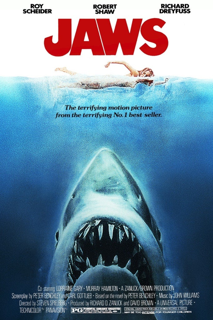 This film poster is well regarded as it conveys the main idea and narration of the film, as well as visually enticing an audience. The centre image used is a crucial key convention used that contributes to this film poster as being regarded as one of the greatest of all times - the angle at which the shark is captured signifies threat and danger as it is showing the shark and swimming upwards towards swimmers, bearing rows of sharp teeth. This image, therefore, represents the horror genre as it is explicitly uses an image which suggests death and danger - key aspects of a horror film. The bold red title name above the image is also effective in showing genre and narration - the red can connote to danger and blood. Poster uses adjectives like "terrifying" which help audience to identify the genre of film.
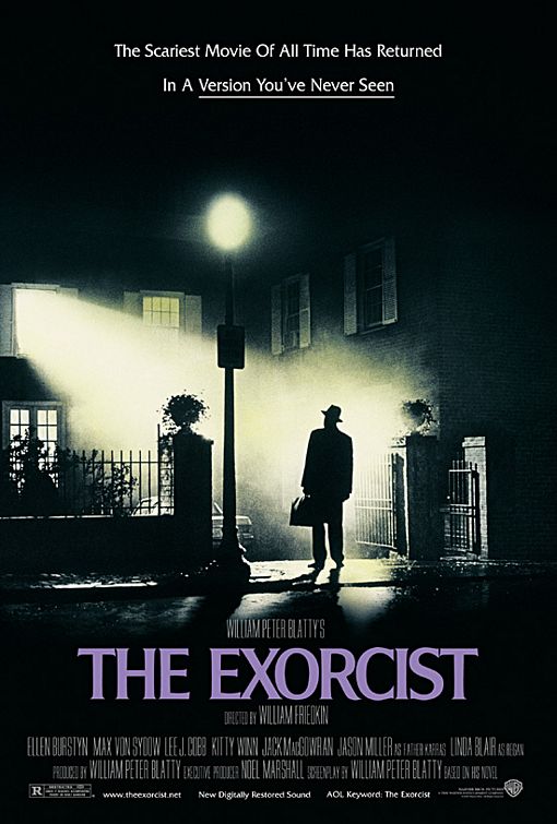
The exorcist film poster is regarded one of the best film posters of all time as the central image is one of the main, memorable scenes from the film when the Priest is just about to enter the house consumed by an evil spirit. As this image is identifiable and well known the audience would immediately be drawn in. The poster is pretty basic and does not contain much text, but the little text that it does contain is successful in portraying the horror genre, making it appeal more to an audience who is interested in horror - "scariest movie of all time".
4) Look back at your statement of intent. What are you planning to produce in terms of your film posters? Can you take inspiration from your research above?
When creating my film posters I intend to make them more visually impacting rather than including multiple images and text. I think using minimal text and a visually impacting image will be more successful as the little text I do use will be straight to the point and direct in targeting the specified audience. The Exorcist poster has inspired me to do this as I feel that there is something more eerie and appealing about having that one dark image with minimal text which has been used to directly convey the horror genre if audiences did not pick it up from the image.
Film poster research - genre
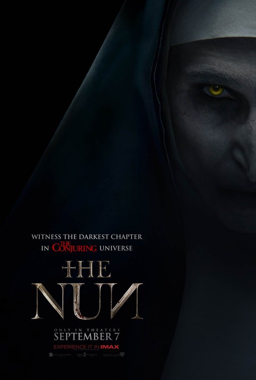


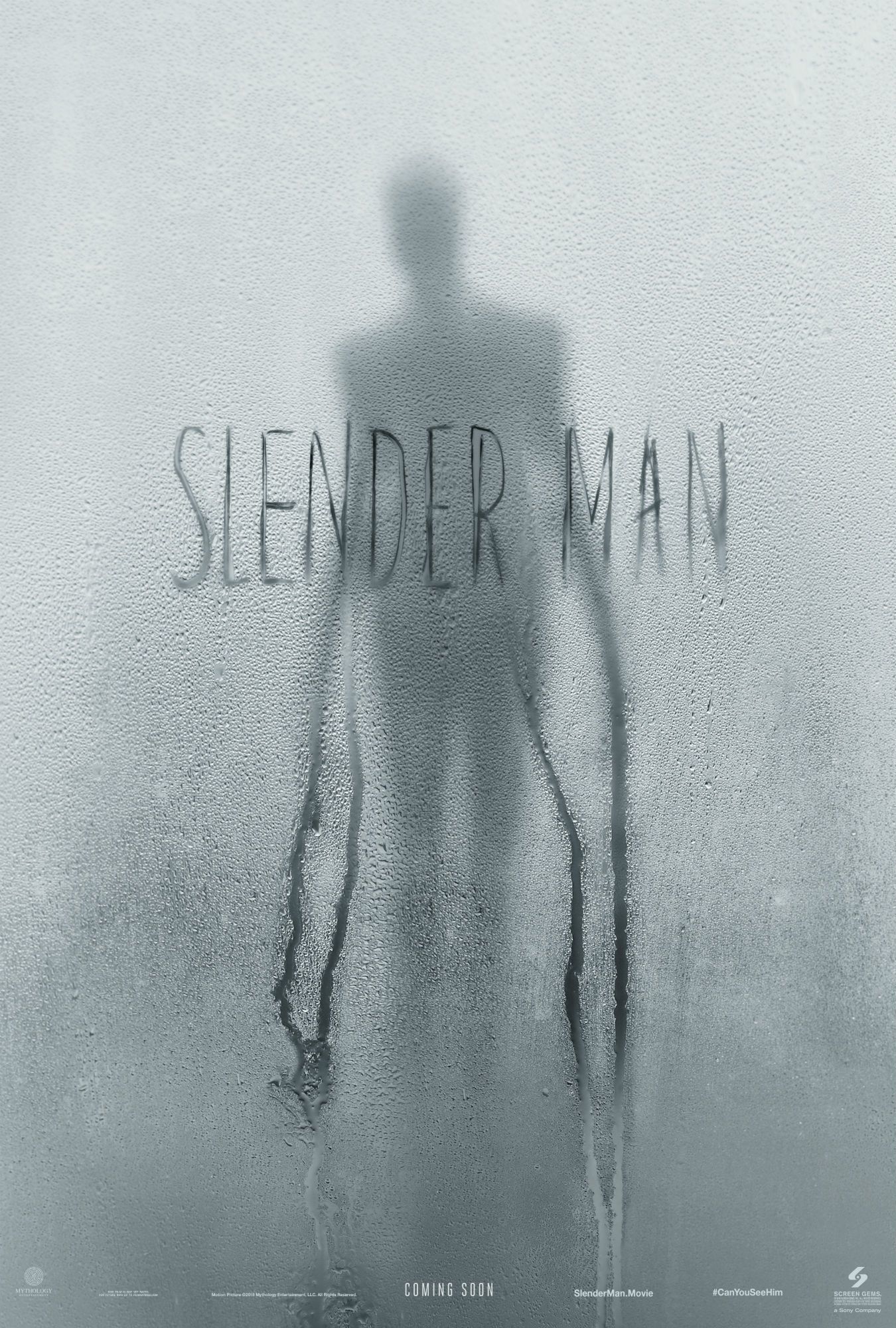

1) What conventions are the same on each poster for the same film and what differences can you find between the alternative posters for the same film?
Each poster uses consistent film branding - e.g: the nun film posters all use the character Valak (the demon) on the front and all consist of the sign of the cross in the text or somewhere on the poster. All posters contain either low-key lighting or dark imagery - a traditional horror convention to convey genre. In the nun film posters they all use the same colour scheme - black white and red - creating synergy between posters.
2) What target audience do you think each poster is targeting and why? How can you tell?
I think all posters are quite similar and it is difficult to tell the individual target audiences that they are aimed at.
3) What can you use from these posters in your own film poster planning and production?
- Low key lighting
- Religion imagery
- Demonic dark imagery
- Synergy between all posters
- Minimal tag lines and writing on poster
Planning and sketching
1) Create a spider diagram or bullet point list of everything you plan to include in your film posters AND all the ways you could target the three target audience segments outlined in the brief: fans of the genre, males, females. Make sure you also create a local film festival in order to meet this aspect of the brief.
Male:
- Use image of main character, Michael. As he is a male I am intending for this to appeal to a male audience as they may be able to feel they can relate more to someone who has the same gender as them - this would create more of an appeal.
- The mise en scene will be more graphic and intense as more violent imagery would appeal to a male audience - possible use of blood and gore, definite use of dark lighting, dark clothing, shadows
- The shot I want to capture will be of the character screaming, showing distress and the sense of him being 'trapped'
Female:
- I aim to use the female hero character in this film poster as I feel it will strongly appeal to a female demographic and would empower them as not being the vulnerable victim in a horror film, subverting typical genre conventions.
- I think it is crucial to also use the main character in this poster to depict narration
Fans of the genre:
- I aim to focus more on mood and an accurate depiction of horror genre through the use of setting and horror connoted imagery - religion, shadows indicating spirits etc.
2) Produce an A4 sketch for your first film poster, adding significant detail in terms of text and planned images (you don't need to draw the image if you don't want to - but must offer a detailed text-based description if not). Clearly label which segment of the target audience you are aiming for with this poster and where the poster will be displayed (outside location, magazine or newspaper etc.) Remember that each poster can either be landscape or portrait and also needs to link to the local film festival that will be screening the film (see details in brief above). When you have sketched the poster, scan or photograph it and add it to your blogpost.
3) Produce an A4 sketch for your second film poster, clearly identifying the segment of the target audience this poster will be aiming at. Pay particular attention to details you will either keep consistent (to create a brand identity and cover the local film festival aspect) or change (to alter the target audience). When you have sketched the poster, scan or photograph it and add it to your blogpost.
4) Produce an A4 sketch for your third film poster, clearly identifying the segment of the target audience this poster will be aiming at. Pay particular attention to details you will either keep consistent (to create a brand identity and cover the local film festival aspect) or change (to alter the target audience). When you have sketched the poster, scan or photograph it and add it to your blogpost.
Photoshoot planning
1) Which of your characters will appear on each poster? If the characters will be the same on each poster, how will you differentiate the images?
-Main character, Michael
-The 'hero', Michael's friend
I will differ the images in term of how graphic they are as I feel that more graphic imagery will appeal to a male audience more than it may appeal to a female audience. In terms of the poster appealing to an overall horror fan audience I aim to use a less focused picture, possibly focusing more on setting and mood rather than character.
2) What images do you need for each film poster? Write a detailed description.
Male - For the poster aimed at a male audience I am going to feature a close up picture of Michael (main character)
3) Write a shot list for the photoshoot(s). Make sure you plan a variety of camera shots you will look to capture (medium shots, close-ups etc.) to give yourself flexibility when designing the posters in Photoshop later. Will the photoshoot be out on location or in school with the white backdrop and lighting?
4) What costume, props or make-up will you require for the photoshoot(s)?
-False blood
-Dark clothing (hooded jumper)
-Low lighting
-Pale make up

Comments
Post a Comment